
Introduction
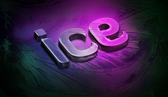
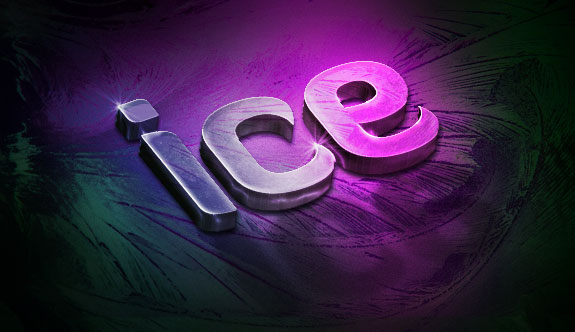
3D text effects are a growing and awesome design trend. They can add angles, lighting and interest that many 2D text effects can’t bring. Here is an awesome Showcase of 3D Typography that was put together a little while back by Angie Bowen. I’ve also been seen and been inspired by tutorials like 3D Text on Fire and this Fresh Text Effect.After some experimenting with what can be accomplished using Illustrator’s 3D capabilities and Photoshop’s texturing I came up with the design for this tutorial. In the steps that follow you will learn some pretty helpful techniques and tricks all while designing your own slick 3D ice text effect. Let’s get started.
The Preview & PSD
Step 1
Fire up Illustrator and type in your word(s) at the size you are designing for. I used Diavlo bold for my font of choice. Be sure to change the font color to a mid-tone gray. It’s not important to choose a specific color yet, but we do need something that will have a strong enough contrast to stand out when we transform the text into 3D.
Step 2
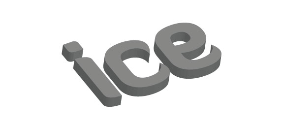
Now it’s time to utilize Illustrator’s simple, but awesome 3D capabilities. With your text selected choose Effect->3D->Extrude & Bevel. Make sure to tick on the preview option so that you can view your results as you go along (be warned this 3D effect with preview turned on is a huge memory hog — slower computers beware). Then manipulate the text into the angle that you desire. Bear in mind, perspective is the trickiest and most important part of a 3D text effect, so take your time here. The cube in the top left is a great visual tool. Simply click and drag on different parts to manipulate the x, y and z axis. Or if you prefer the cliff notes, just alter the settings to what is referenced below.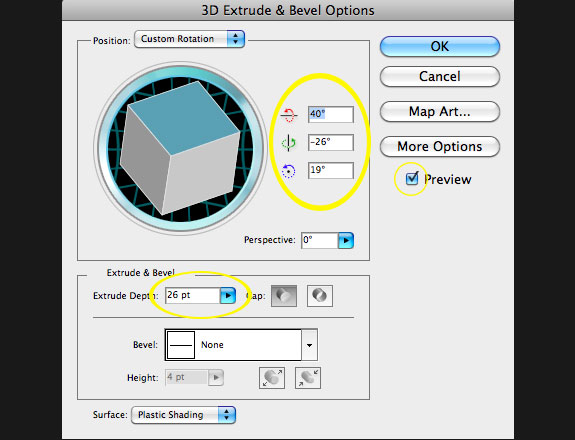
Step 3
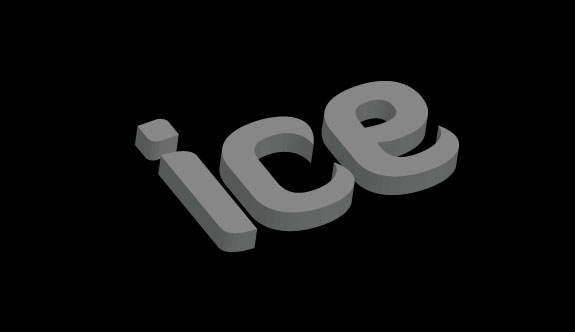
Now it’s time to move our project over to Photoshop. Open up a new document in Photoshop, then click back to Illustrator and put the two documents side by side. Grab the move tool in Illustrator and drag the 3D text from Illustrator into the Photoshop document. Then in Photoshop select the background layer and fill it with black.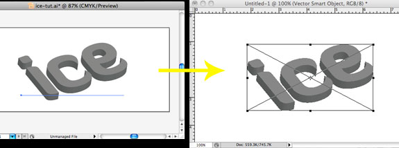
Step 4
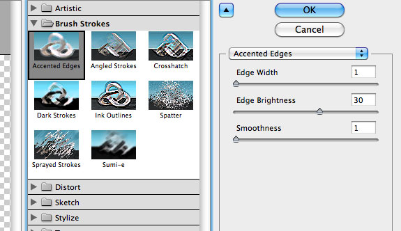
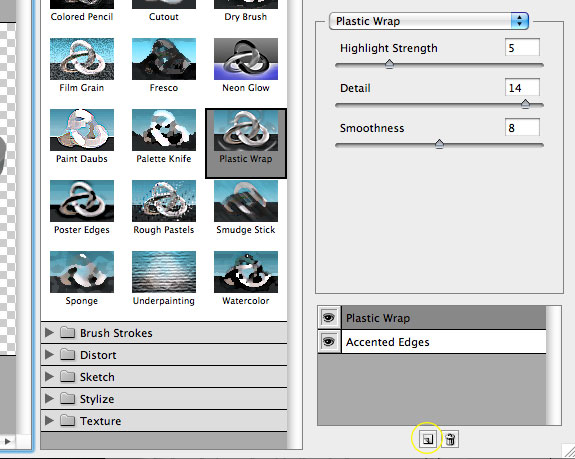
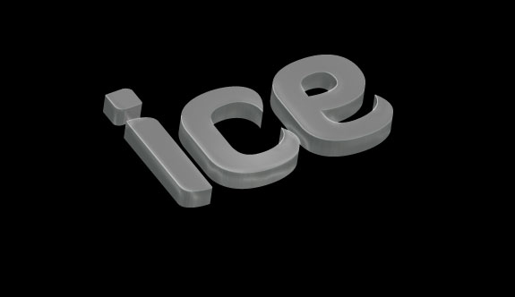
Filters offer a huge range of possibilities, but they can lead to some pretty horrific results when they are overdone or used inproperly. In our case, we are going to add a couple of minor tweaks, to start the illusion of highlights and shadows on raised ice.The Filter Gallery is a very handy interface that you can use to add and combine various filters. To get started click Filter->Filter Gallery. First, add ‘Accented Edges’. Play around with the settings until you have some simple, but not blown out highlights on the edges of your 3D text. Below are the settings that I used. Now, click to add a second filter (using the small ‘Add Filter’ button in the bottom right), choose ‘Plastic Wrap’ and select settings similar to what is referenced below. Then click ok.
Step 5
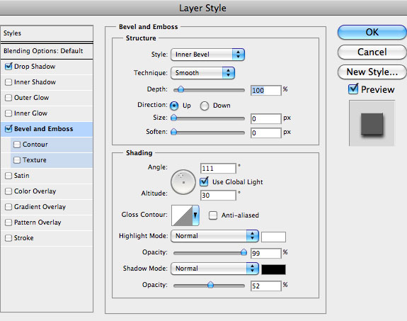
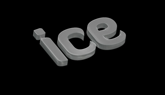
Our filters gave us some nice highlights on the edges of the 3D text, but I think we could do a little better yet. Let’s take advantage of some of the things layer styles have to offer. Double click on the 3D text layer to bring up the layer styles box. Add a bevel and emboss, and a drop shadow to our text. The drop shadow will be rather unnoticeable against our black background, but it will look good when we set up the ice background. Use settings that are similar to those shown below.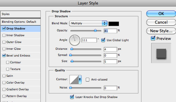
Step 6
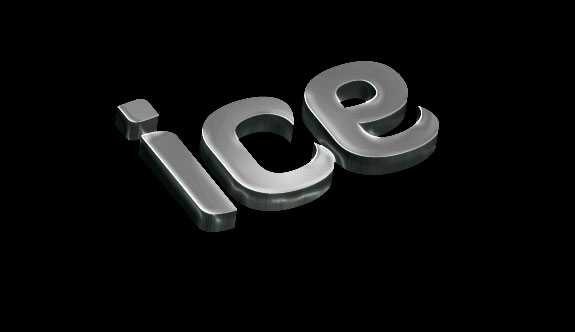
That’s starting to look cool, but we could definitely use some more contrast. To add some, click Image->Adjustments->Shadows/Highlights. There are a ton of sliders to play around with in here, and quite honestly moving them around and experimenting is the best way to learn what they do. It’s also good to note, that since we brought over this text from Illustrator it should be a smart object. Which means that these filters are non-destructive and can be easily tweaked at a later point.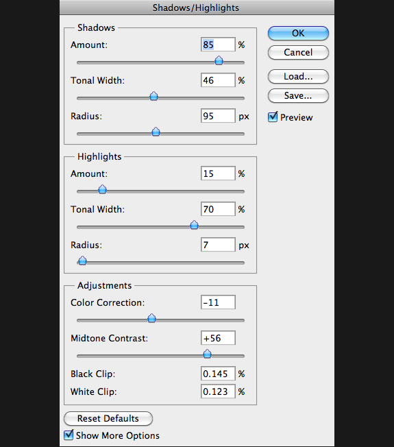
Step 7
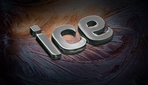
In this step we are going to start working on the background ice. We need an interesting ice texture with some bright colors (even though we’ll be altering them later). I found this really cool ice texture on Flickr. Download that one or something similar and place it on a layer below the text layer and above the black background. Add a layer mask to your new layer by clicking Layer->Vector Mask->Reveal All. We want to gradually fade our design out to the black background, so add a radial gradient to that layer mask that goes from black on the outside to white on the inside. Touch up some of the mask with a soft brush with low opacity if necessary. Lastly, drop the opacity of this layer to about 90%.

Step 8
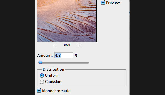
The background is starting to look interesting, but the texture could definitely be simplified and smoothed out a bit. I personally like to make those kinds of changes on a smart object so that I can adjust them later if I change my mind. So, right click on the layer and choose ‘Covert to Smart Object’. Then click Filter->Blur->Surface Blur. Use this blur to soften the texture and contrast some. Then add a bit of simple noise back in by clicking Filter->Noise->Add Noise. The settings I used are shown below as a reference.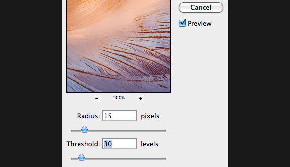

Step 9
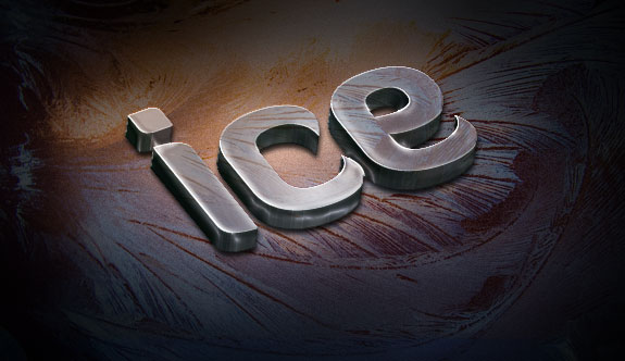
Let’s add some of this same texture to the text to help with realism and consistency. Duplicate the ice background layer and place it at the top of the layers palette. Add a layer mask to this layer just like you did before. Fill the layer mask with all black. Then select the shape of the ice text by ‘cmd + click’ on the thumbnail in the layers palette as circled below. Fill the shape that you just selected on the layer mask with white. This will reveal the texture only on the ice text. Now, change the layer mode to Overlay and the opacity to about 85%. Lastly, you can unlink the mask and the layer to move the texture independent of the mask. This give you great flexibility to change the texture on the text to something you find visually striking.

Step 10
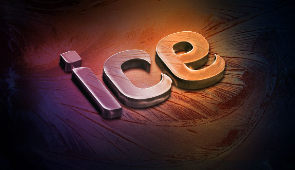
In the next two steps I want to work on the coloring. Add a new layer to the top of your layers palette. Then grab the gradient tool and make a colorful gradient that begins and ends with the same color and goes to two other colors toward the middle. This gives our illustration a nice smooth base color to work from. Drag out a linear gradient horizontally across your canvas. Change the blend mode for this layer to overlay.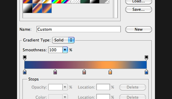
Step 11
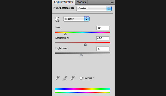
Create a Hue/Saturation adjustment layer by clicking on the icon at the bottom of the layers palette (referenced below). Adjust the sliders until you have a nice cool colored gradient.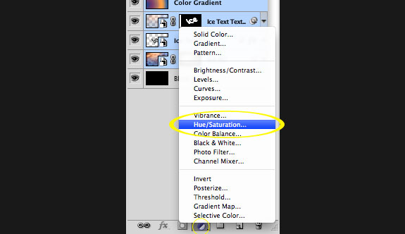
Step 12
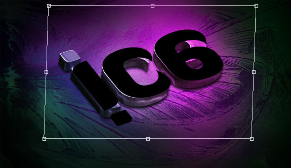
Since our subject is ice and we have some cool lighting effects going on we definitely need to add a nice reflection. This can be a tad tricky with 3D objects, as the extra dimension can play tricks on your eyes. Because the refection on the ice is really only 2D I found the best and simplest way to add that is to create a new flat text layer that mimics the size and perspective of the 3D text. Make a new text layer and retype ‘ice’ or whatever the word you choose to use was in the same font. Then click ‘cmd + t’ to bring up the free transform tool. Click and drag downward from the top middle anchor to reflect the text. Next rotate it by hovering over a corner point to get the rotate cursor. Then adjust the corners while holding down ‘cmd’ to skew the text. Get it to the point that it fits pretty well over the 3D text, like the image below, bear in mind that it doesn’t need to be perfect.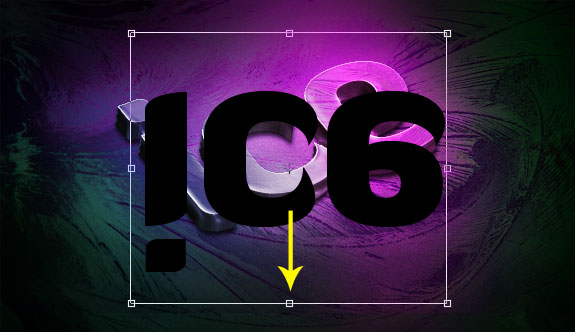
Step 13
Now drag the refection into place and move the reflection layer below the 3D text layer. Change the blend mode to overlay and the opacity to 45%. Rasterize the layer by right clicking and choosing ‘Rasterize Layer. Then click Filter->Blur->Gaussian Blur and blur the shadow a bit. Lastly, add a layer mask and fade it out toward the bottom of the reflection.
Step 14
We’re almost done here, but a lot of times it’s the finishing touches that can take a design from good to great. I went on the look out for some cool brushes and found this awesome set. Go ahead and download them or something similar. Add a new layer and use the same masking technique that you used in step 9, so that the brush you use will only show on the 3D text. Then grab a star brush, use white for your color and dab on some interesting texture. Change your blend mode to overlay and drop your opacity to about half.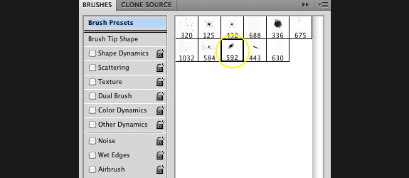

Step 15
Lastly add a couple more layers and utilize a couple of the star brushes to make some sparkle highlights. Be careful not to overdo this step. It’s also a good idea to put each one on a different layer, so that you can experiment with where the sparkle looks best and vary the brightness by lowering the opacity a bit.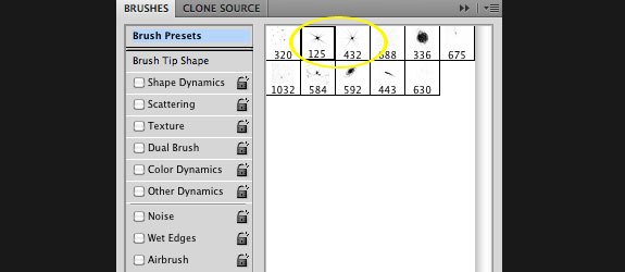
Final Thoughts
There are so many creative directions you can take these techniques. The main thing I wanted to get across was the simplicity of 3D text in Illustrator and the power of combining Illustrator and Photoshop.by: http://creativeoverflow.net


0 comments:
Posting Komentar